The View From Here
By Belinda
 We left our home in the hands of Sue, our daughter-in-law, when we went to England. She was painting our entrance hallway (which is huge;) kitchen; office, and TV room.
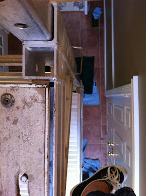
We were coming back on August 1, and on July 30, she sent me this message on FB with a photo.
"The view from up here. I would take a better shot but I don't want you to see the colour yet. Should be all finished tomorrow!!"
The photo was scary in more than one way. Of course, my heart leaped into my mouth at the sight of the height to which Sue had climbed on the scaffolding. Even now it makes the palms of my hands clammy. I was also nervous about my colour choice for the hallway, Benjamin Moore's Honey Moon, a pale dijon yellow. I left for England wondering if I'd made the right choice.
I have had my share of decorating disasters. I don't think that I have an eye for choosing colour, but I know when I love something (and it's usually in someone else's house.)
Our hallway had been a safe taupe colour for about 10 years. I loved it, but it was time for fresh paint and a change. One day when I was still deliberating over colours, the writers group that meets here arrived.
"Yellow will make your art work pop!" said a writer who is also an amazingly gifted graphic artist.
From that moment I took a leap that made me nervous, towards a lighter, brighter shade of pale!
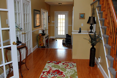
As we opened the front door and entered the house, I was holding my breath. And when I walked in, I still didn't exhale. Sue said that at one point as the colour went on, she thought, "Oh, no, what have we done!" And that's a little how I felt when I first saw it. It was so different from the dark taupe, and the hall looked so bright--and dazzlingly yellow! And the new flooring that had looked a deep honey next to the taupe, now looked gold.
Sue had done an amazing job of the painting so I called her to thank her for all of her hard work--it was her biggest job so far in her painting business, which she is considering calling, "Burston with Colour!" :)
She nervously asked, "Do you like the colour?"
"It's so different, I'm adjusting to it Sue," I said. She knew exactly what I meant.
"It's funny,I thought it was much more of a caramel," she said.
She had hung our big picture of poppies on one of the walls to break up the yellow, but even that looked to me to be too bright.
Fortunately Brenda convinced me that the poppies were wonderful, and I started to see the space with accents of red and black. I realized that some of the accessories that had gone with the taupe just didn't match the yellow and I could hardly wait to go shopping on Saturday for accents for the new colour scheme. When I did, I found a rug and table runner on sale at Pier 1 Imports, some beautiful prints at Costco and an inexpensive lamp at Canadian Tire.
I worked so hard that day--and in the end, we have the most beautiful, welcoming hallway you could imagine.
 Sometimes a bold decision takes your breath away. This one did. It was a big risk for such a large space. I am grateful for the happiness that floods my heart now as the light pours down from the skylight into the warm and cosy hallway that is our home.
Welcome!


We were coming back on August 1, and on July 30, she sent me this message on FB with a photo.
"The view from up here. I would take a better shot but I don't want you to see the colour yet. Should be all finished tomorrow!!"
The photo was scary in more than one way. Of course, my heart leaped into my mouth at the sight of the height to which Sue had climbed on the scaffolding. Even now it makes the palms of my hands clammy. I was also nervous about my colour choice for the hallway, Benjamin Moore's Honey Moon, a pale dijon yellow. I left for England wondering if I'd made the right choice.
I have had my share of decorating disasters. I don't think that I have an eye for choosing colour, but I know when I love something (and it's usually in someone else's house.)
Our hallway had been a safe taupe colour for about 10 years. I loved it, but it was time for fresh paint and a change. One day when I was still deliberating over colours, the writers group that meets here arrived.
"Yellow will make your art work pop!" said a writer who is also an amazingly gifted graphic artist.
From that moment I took a leap that made me nervous, towards a lighter, brighter shade of pale!
As we opened the front door and entered the house, I was holding my breath. And when I walked in, I still didn't exhale. Sue said that at one point as the colour went on, she thought, "Oh, no, what have we done!" And that's a little how I felt when I first saw it. It was so different from the dark taupe, and the hall looked so bright--and dazzlingly yellow! And the new flooring that had looked a deep honey next to the taupe, now looked gold.
Sue had done an amazing job of the painting so I called her to thank her for all of her hard work--it was her biggest job so far in her painting business, which she is considering calling, "Burston with Colour!" :)
She nervously asked, "Do you like the colour?"
"It's so different, I'm adjusting to it Sue," I said. She knew exactly what I meant.
"It's funny,I thought it was much more of a caramel," she said.
She had hung our big picture of poppies on one of the walls to break up the yellow, but even that looked to me to be too bright.
Fortunately Brenda convinced me that the poppies were wonderful, and I started to see the space with accents of red and black. I realized that some of the accessories that had gone with the taupe just didn't match the yellow and I could hardly wait to go shopping on Saturday for accents for the new colour scheme. When I did, I found a rug and table runner on sale at Pier 1 Imports, some beautiful prints at Costco and an inexpensive lamp at Canadian Tire.
I worked so hard that day--and in the end, we have the most beautiful, welcoming hallway you could imagine.
 Sometimes a bold decision takes your breath away. This one did. It was a big risk for such a large space. I am grateful for the happiness that floods my heart now as the light pours down from the skylight into the warm and cosy hallway that is our home.
Welcome!


Comments
Yes, Dave, the flooring is new--replacing our 1988 vintage carpet!
Thank you Susan, I know your eye for perfection, so I am grateful that you like it.
I once did yellow in geneva and wanted "poussin/chick yellow" and it turned out bright daffodil....
very hard to accessorize!
I loved this, beautiful enough for a magazine spread. Molson fits marvelously with the color scheme as well.